Client / Sector
HealthTech - professional platform for the medical sector
Market
Algeria, French and Arabic, mobile-first
Engagement
Product architecture, full UX design across six phases, waitlist launch, platform engineering
Status / Year
Beta, 2026
The situation
In Algeria, a doctor who needs someone to cover a shift asks a colleague. A clinic that needs a locum posts in a Facebook group. A pharmacist looking for a position hears about one through the person who trained with them. It works because the profession is small enough to be a network, and it fails in exactly the ways an informal network fails: the person with the best contacts gets the shift, a private practice in a smaller wilaya can go weeks without cover, and nobody involved can verify that the person replying to the post is who they say they are.
The rest of a medical professional's working life is scattered the same way. Continuing education is announced by message and word of mouth. Medical and laboratory equipment is bought through whichever supplier's representative happens to visit. Professional questions get asked in general-purpose social groups where the answers are unattributed and unverifiable, and where pharmaceutical marketing sits in the feed without ever being labelled as marketing.
VakMed was specified as a single platform for that whole professional life: recruitment and replacements, accredited courses, an equipment and supplies marketplace, and a professional community, with verification and advertising rules built into the platform rather than left to good faith. We worked from a full French-language functional specification plus a second document of additions, turned it into a scoped product architecture, designed every screen for every role, and shipped a waitlist site first so the audience could be built while the platform was still being drawn.
What made this hard
Four products pretending to be one
Recruitment, courses, a marketplace and a forum are four different businesses with four different data models, and each one wants to become the whole product. The architectural job was to decide what they genuinely share — identity, verification, notifications, payments, the professional's profile — and to keep everything else separate. Without that line drawn early, the recruitment module would have quietly absorbed the other three.
Verification is the product, not a feature
A recruitment platform for healthcare only has value if a clinic can trust that an applicant is a real, licensed professional, and a professional can trust that an offer comes from a real establishment. That means four different proofs: registration number or diploma for practitioners, commercial registration and tax identification for establishments, sector approval for suppliers, and accreditation for training centres. Each one needs its own submission flow, its own review queue and its own failure states.
Advertising to healthcare professionals is regulated
Pharmaceutical and medical promotion is not ordinary advertising; campaigns require the appropriate national approval and must be identifiable as promotion. So sponsorship labelling could not be a styling choice a partner might remove, and approval status had to be a field that decides whether a campaign is served at all. The moderation console gates on it directly.
A doctor's identity is not public property
The obvious way to build a recruitment marketplace is a browsable directory of professionals, and it was ruled out. Practitioners will not put their registration details on a platform that lets any company page through them. The product exposes aggregate counts for audience sizing instead of individual profiles, hides contact details until an application creates a relationship, and lets an offer be shared externally with the sensitive fields stripped out.
A business model that has to stay adjustable
Nobody launching into this market knows yet which audience will pay, and locking prices into code would have made every pricing experiment an engineering ticket. Establishments pay for subscriptions and boosts, partner companies pay per campaign by duration, professionals browse and apply for free, and administration needs to be able to make any audience completely free during a launch period. Every paid surface therefore has to render a credible free state.
How we approached it
We began by translating the specification into a taxonomy, because the vocabulary in the source documents was doing too many jobs at once. Everything that publishes to the platform became a publisher with a subtype — establishments, partner companies, training centres — and everything that consumes became a professional, with administration as a third space entirely. That single decision determined the permission model, the navigation, the verification queues and the pricing structure.
Design then ran in phases, all of them landing in one canvas rather than a folder of disconnected mockups, so that a token changed in the professional space propagated into the admin console. The brand was lifted from the waitlist site we had already shipped, which meant the platform and the public face of the product were the same product from the first artboard.
Specification to scoped architecture
We read the full functional specification and its addenda, resolved the loose naming into a fixed taxonomy of professionals, three publisher types and administration, and mapped which modules each role can see, publish to and pay for. The decisions to drop the public directory, to hide contact details and to cap partner storefront size all came out of this pass.
Waitlist site, shipped first
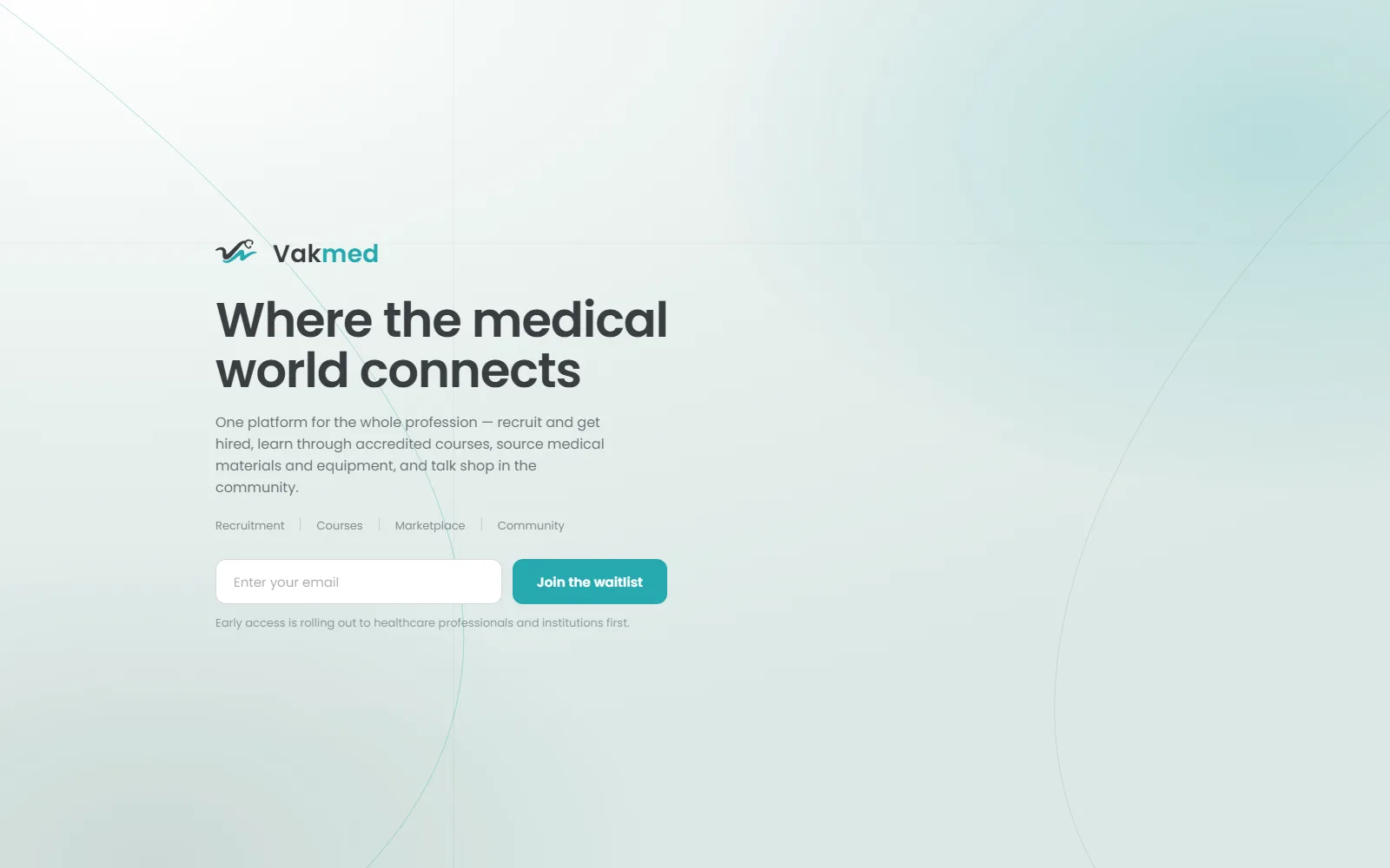
Before the platform existed we designed and shipped a single-page waitlist site with an animated logo build, so that the audience could be assembled while the product was still on the drawing board. It is a lightweight static page rather than a framework build, with server-side validation and abuse protection behind the signup, and it set the brand that the whole platform inherited: the teal and ink palette, the type, the radii.
The professional space
The first platform phase covered the audience that has to love the product before anyone will pay for it: onboarding with CV upload and automatic parsing, verification by registration number or diploma, the offers feed for replacements and positions, applications, and access to courses and the marketplace. Free forever to browse and apply was treated as a design constraint, not a promotion.
Publisher spaces
We then designed the three publishing audiences: establishments with business verification, a monthly offer quota, boosts, a candidate pipeline and a contract step with a mandatory legal acknowledgement; partner companies with approval-typed onboarding, a capped storefront and a campaign builder with profession targeting and duration-based pricing; and training centres publishing courses. Sponsored labelling and campaign approval status were built into these surfaces rather than added at review time.
Community, administration and synthesis
The final phase covered the forum, restructured at the client's direction into topic communities with voting, nested replies, a best-answer mechanism and pseudonymous posting, and the administration console for verification queues, subscription control, moderation and the transactions journal. A closing set of synthesis boards mapped the module architecture, the professional journey, the three publisher journeys and the monetisation levers on one page each.
What we shipped
Professionals
- Onboarding with CV upload and automatic parsing
- Verification by professional registration number or diploma
- Feed of replacement and permanent positions
- Application tracking with contact details revealed on engagement
- Accredited courses feed from verified training centres
- Equipment and supplies feed with mandatory sponsorship labels
Establishments and hiring
- Business verification on commercial registration and tax identification
- Dashboard with a monthly published-offer quota
- Offer publishing with an optional visibility boost
- Candidate pipeline organised by stage
- Contract step with a mandatory legal acknowledgement
- Monthly premium tiers for higher volume
Marketplace, courses and campaigns
- Partner onboarding typed by sector approval
- Supplier storefront with a capped product count
- Campaign builder with multi-profession targeting
- Duration-based campaign pricing
- Pharmaceutical approval gate per campaign
- Course publishing for accredited training centres
Community and administration
- Topic communities with join and leave
- Up and down voting with visible score
- Nested comments and a best-answer mechanism
- Pseudonymous posting for sensitive questions
- Sponsored webinars behind explicit opt-in consent
- Admin verification queues, subscription control, moderation and a transactions journal
Engineering decisions
The choices that shaped the build, and what each one traded away.
Role-scoped modules instead of one permission matrix
Rather than build one application and hide parts of it per role, each audience gets its own module set, its own navigation and its own dashboards, sharing only identity, verification, notifications and payments. It is more surface to design and maintain, and some primitives exist twice. The payoff is that no establishment capability can leak into a professional account through a mis-set flag, which in a platform holding licence numbers and hiring decisions is worth the duplication.
Verification gates actions, not accounts
An unverified user can register, complete a profile and look around; what verification unlocks is publishing, applying and transacting. This keeps the funnel open while keeping the trust guarantee intact, at the cost of a richer state machine — pending, verified, rejected, expired — that every gated surface has to render honestly, plus a real review queue in the admin console that someone has to staff. We considered gating at registration and rejected it: a platform that asks for a licence number before showing anything gets very few licence numbers.
Sponsorship enforced at render, approval enforced at serve
The sponsored label is applied by the feed component itself and is not a field a partner can set, style or omit, and a campaign's regulatory approval status is checked before it is eligible to be served at all. Partners lose creative control over how their promotion is framed, which is exactly the intent. Moderation therefore has one gate to enforce rather than a policy it has to police after publication.
Aggregate counts instead of a public directory
Advertisers need to know how many cardiologists they can reach; they do not need to know who those cardiologists are. Targeting is built on counted audience segments, so a campaign builder can show reach for a profession and region combination without ever exposing a member. Advertisers get less control than on a platform that lets them hand-pick recipients, and that reduction is the feature — it is what makes the platform safe for practitioners to join.
Pricing as data, with a free switch per audience
Subscription prices, campaign rates, boost costs and quotas are all administrator-editable values, and each audience carries a switch that makes it entirely free. Payment is designed around the local card rails rather than international cards, because that is how this market pays. The consequence is that every commercial surface needs two designed states — priced and free — but the launch strategy can change on a Tuesday afternoon without a release.
The outcome
VakMed exists today as a shipped public waitlist and a fully designed platform: thirty-four screens across six phases in a single canvas, covering the professional space, the three publishing audiences, the community and the administration console, plus a synthesis set that maps the modules, the user journeys and the monetisation model. That is the artefact a founder can take to an institution or an investor and have a concrete conversation about, rather than a description.
Early access is rolling out to healthcare professionals and institutions first, starting with the recruitment core, the module with the clearest immediate value and the one that makes verification worth doing. Courses, the equipment marketplace and the community are designed and sequenced behind it, which is a deliberate order: a community with nobody in it is a liability, and a community built on an already-verified professional base is not.
What changes, if it lands, is small and specific. A locum request stops being a favour asked in a group chat and becomes a published, verified offer that a qualified practitioner in another wilaya can see and apply to. Pharmaceutical promotion stops being an unlabelled message in a feed and becomes an approved, labelled campaign a professional can identify as promotion.
4
Core modules
Recruitment and replacements, accredited courses, an equipment and supplies marketplace, and a professional community.
4
Verified account types
Professionals, establishments, partner suppliers and training centres, each with its own required proof and its own review queue in the admin console.
34
Screens designed
Across six phases in one shared canvas, covering every role from professional onboarding to the admin transactions journal.
2
Interface languages
French and Arabic, mobile-first, with the Arabic right-to-left pass scoped as its own layout system rather than as a translation.
Honestly
The platform is at the start of its life, and we would rather say that plainly than dress a waitlist up as traction. What exists is a complete architecture, a complete design and a live public front door; what does not exist yet is a filled catalogue of offers, courses and suppliers, and no amount of product design substitutes for that. The rollout is sequenced around the module that can create its own value fastest.
The trade-off we accepted knowingly is the cost of scoping by role. Five audiences with their own module sets is more design, more testing and more maintenance than one adaptive interface, and on a small team that is a real tax. We took it because the alternative — one interface whose behaviour depends on a permission matrix — is precisely how sensitive data leaks between audiences. The next work is the Arabic right-to-left pass, which is not a translation task but a second layout system, and then the build-out of the recruitment core.
Frequently asked
What is VakMed?
VakMed is a platform for the medical profession that brings four things together: a recruitment marketplace for replacements and permanent positions, accredited continuing-education courses, a marketplace for medical equipment and supplies, and a professional community. It is designed mobile-first for Algeria, in French and Arabic, with verification built into every account type.
Is VakMed available yet?
It is in early access. A public waitlist is live now, and the platform is rolling out to healthcare professionals and institutions first, starting with the recruitment core. The remaining modules — courses, the equipment marketplace and the community — are fully designed and sequenced behind it.
How does VakMed verify doctors, clinics and suppliers?
Each account type has its own proof. Practitioners verify with a professional registration number or a diploma, establishments with commercial registration and tax identification, suppliers with the relevant sector approval, and training centres with their accreditation. Verification gates publishing, applying and transacting rather than account creation, and every submission goes through a review queue in the administration console.
Who designed and built VakMed?
KinxLab. We took the client's functional specification and its addenda, turned it into a scoped product architecture of roles and modules, designed the entire platform across six phases and thirty-four screens, and shipped the public waitlist site that carries the brand.