Client / Sector
Media - Arabic digital reading platform and mobile app
Market
Arabic-language readers, priced in Algerian dinars
Engagement
Product design, editorial brand, platform engineering, mobile app
Status / Year
Live, 2026
The situation
Arabic is one of the most spoken languages on earth and one of the worst served by digital reading. Most Arabic books circulate as scanned PDFs passed around in messaging groups: unsearchable images of pages, no reflow, no adjustable type, no way for the publisher or the author to see a single dinar. Readers are not choosing that experience because they prefer it. They are choosing it because for a great many titles it is the only version that exists.
The reading products that do exist are usually built for Latin text first and turned around afterwards. Right-to-left arrives as a stylesheet flip, the type is set with metrics designed for the Latin alphabet, diacritics collide with the line above, and the interface still reads as a translated foreign object. For a reader raised on well-set printed Arabic — a tradition with its own centuries of typographic craft — that gap is immediately obvious and quietly insulting.
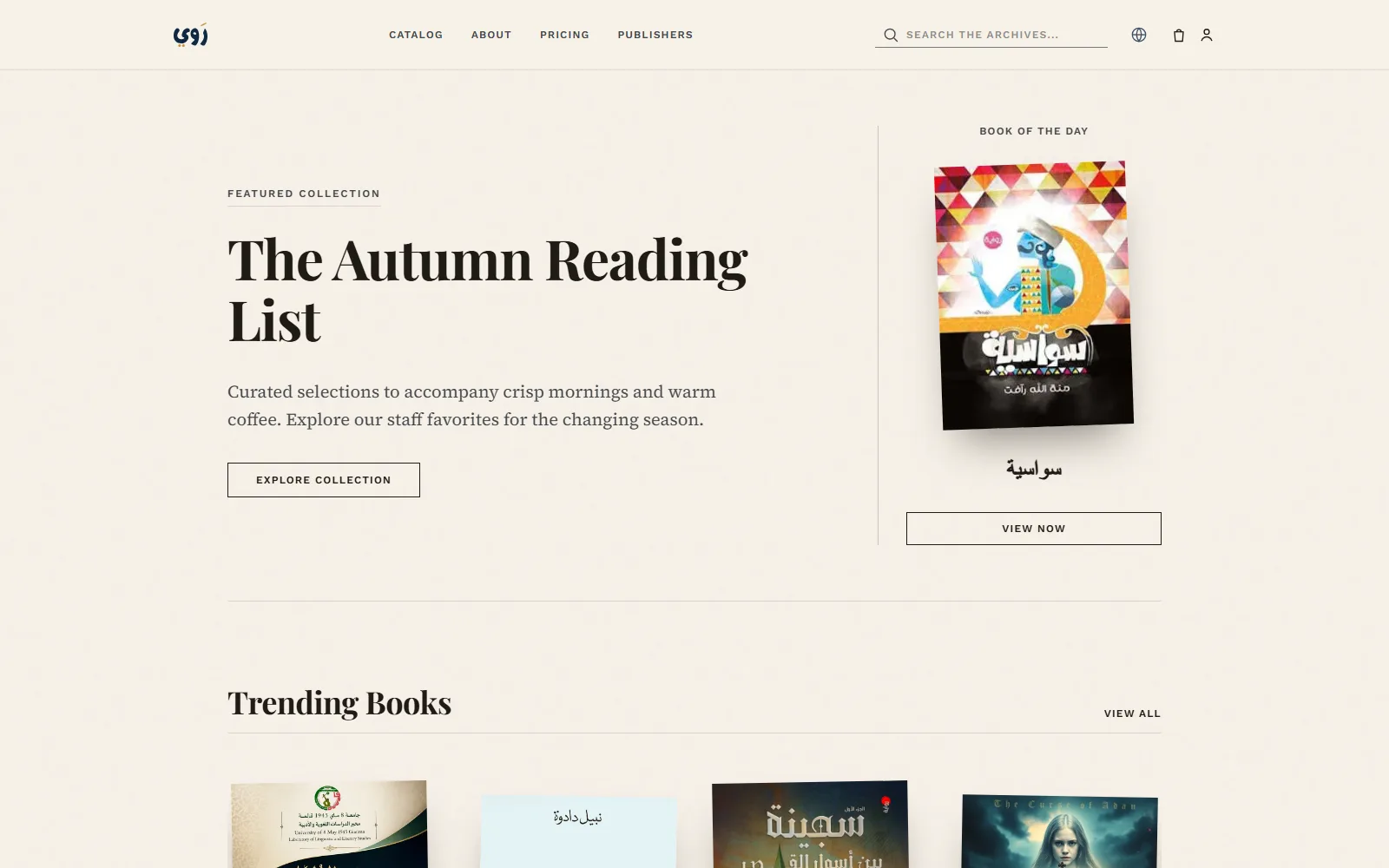
Rawey was built as the opposite premise: an Arabic-first library where the design starts from Arabic text and works outward. Curated collections and a book of the day give it the feel of a bookshop with a bookseller in it rather than a search box over a database; e-books, audiobooks and podcasts sit in one catalogue; publishers get accounts and a route to distribute; and subscriptions are priced in dinars for a readership that international services price out. We designed and built the platform, the mobile app and the editorial brand.
What made this hard
Right-to-left is not a CSS property
Flipping the writing direction is the easy part. The rest is that progress bars, sliders, carousels, chevrons, back gestures and page-turn animations all have a directional meaning that has to invert, while clocks, media scrubbers and Latin-script author names must not. Every component had to be audited for whether its direction is semantic or merely visual, and the answer differs component by component.
Arabic search breaks every default
The same word is legitimately written several ways: hamza carriers vary, the closed taa and the plain haa are interchanged, the dotted and dotless final yaa are used interchangeably, and diacritics may be present or absent. On top of that the definite article fuses to the front of nouns and Arabic plurals are formed by changing the inside of a word rather than adding a suffix, which defeats ordinary stemming. A reader typing a title from memory will not match a stored string exactly, and out of the box the search returns nothing.
Publisher catalogues arrive messy
Arabic publishing has patchy metadata: missing or inconsistent identifiers, author names spelled several ways and sometimes transliterated into Latin, dates that refer to a printing rather than a work, and covers supplied at whatever resolution was on hand. A marketplace that ingests this raw ends up with the same book listed three times. The ingestion path had to normalise and deduplicate without silently discarding editions that genuinely differ.
Three content formats, one library
An e-book, an audiobook and a podcast episode have different players, different progress models and different rights, but a reader thinks of them as one shelf. They also sit at different depths of the subscription: the general catalogue at the entry tier, audiobooks and podcasts deeper in, summaries and periodicals deeper still. Modelling that so a single title can be reachable by plan, by purchase or as a preview took more thought than any interface in the product.
Making a database feel like a bookshop
The default shape of a catalogue product is a grid with filters, which is useful and completely uninviting. Reading is chosen by mood, season and recommendation far more than by facet. The editorial surfaces — the seasonal reading list, the book of the day, the featured podcast — had to be first-class scheduled content rather than decoration on top of a search index.
How we approached it
We designed the type before we designed the screens. The whole product rests on long-form Arabic being genuinely comfortable to read on a phone, so the first work was a typographic system built around Naskh letterforms: line heights sized for the vertical reach of Arabic ascenders and vowel marks, an optical size larger than a Latin equivalent, and a warm cream ground that lowers contrast the way paper does. The visual identity — cream, ink, classic book proportions — came out of that work rather than being applied to it.
In parallel we treated Arabic text handling as an engineering problem with its own layer, not as a locale setting. Normalisation sits in front of search, layout is written in logical rather than physical directions, and the catalogue model carries the entitlement logic that lets one title be reached three different ways. Everything the reader sees is built on top of those three foundations.
Typographic and editorial foundation
We built the Arabic type scale first, covering face selection, optical size, line height for diacritics and the Latin fallback for author names and numerals, then settled the cream and ink palette around it. This produced a brand that reads as a literary imprint rather than a technology product, which is the correct signal for a reader deciding whether to trust a library.
Catalogue model and publisher intake
We modelled works, editions, formats and contributors as distinct entities so that the same book existing as text and as audio is one work with two formats rather than two listings. The publisher submission path was designed around normalisation and review, so that catalogues arriving with inconsistent metadata are cleaned on the way in rather than apologised for later.
Discovery and editorial surfaces
We designed the home experience as a sequence of curated rows, each one schedulable by an editor: a seasonal reading list, the book of the day, trending titles, best audiobooks, a featured podcast, then browse by category. Search sits alongside them for readers who arrive knowing what they want, running on the normalisation layer built in the same phase.
Subscriptions, entitlements and checkout
We built the three subscription terms and the single-title cart on top of one entitlement resolver, so that access is answered once regardless of how it was acquired. Pricing is set in dinars, and the tier structure was designed so each step up unlocks a distinguishable kind of content rather than simply more of the same.
Mobile app and launch catalogue
The mobile app was built against the same catalogue and entitlement services as the web library, so a subscription and a reading session mean the same thing on both. Launch then became a catalogue exercise: onboarding publishers, cleaning their metadata and filling the eight browse categories deeply enough that the shelves look like a bookshop rather than a demo.
What we shipped
Discovery and editorial
- Curated seasonal reading collections
- Book of the day
- Trending titles
- Best audiobooks shelf
- Featured podcast
- Browse across eight categories, plus search over the archive
Reading and listening
- Arabic-first reading layout built around Naskh letterforms
- Audiobook playback alongside the text catalogue
- Podcast episodes in the same library
- Cover-forward book pages with publisher and category context
- Mobile app sharing the web library's catalogue and account
Publishers
- Publisher accounts and a public submission route
- Catalogue intake with metadata normalisation
- Work, edition and format modelling for text and audio
- Category and collection placement
- Distribution to both web and mobile readers
Accounts and commerce
- Three subscription terms: monthly, six-month and annual
- Tier-gated depth: general catalogue, then audiobooks and podcasts, then summaries and periodicals
- Cart and checkout for individual titles
- Dinar pricing for a local readership
- Account, catalogue, plans and publisher sections with full policy pages
Engineering decisions
The choices that shaped the build, and what each one traded away.
An Arabic normalisation layer in front of search
Before anything is indexed or queried we strip vowel marks and elongation characters, fold the hamza carriers to a single alef, unify the closed taa with the plain haa and the dotless final yaa with the dotted one, and handle the fused definite article. Because normalisation destroys real distinctions between some minimal pairs, the original form is indexed alongside the normalised one and exact matches are ranked above folded ones, with trigram similarity as a fallback for genuine typos. This combination does more for Arabic recall than stemming alone, which struggles with plurals formed by changing a word internally rather than by suffix.
A type system built on Naskh, not on a serif
Arabic has no uppercase and no true italic, so the emphasis hierarchy that Latin design leans on does not exist and has to be rebuilt from weight, size, colour and space. We set line height for the actual vertical extent of Arabic — ascenders and vowel marks reach further than Latin metrics assume — and raised the optical size, which costs words per screen and makes pages longer. We took the density hit deliberately: a page that fits more text and is tiring to read is worth nothing in a product whose entire purpose is sustained reading.
Logical layout properties instead of a right-to-left override
The interface is written in start and end terms rather than left and right, so one layout serves both directions instead of a base stylesheet plus a right-to-left patch that drifts out of sync. It requires discipline — physical margins and paddings are effectively banned from the codebase — and a per-component decision about whether direction is semantic or visual, because a media scrubber must not mirror while a reading-progress bar must. The reward is that adding another language later is a content problem, not a second front end.
One entitlement resolver, three routes to a book
A title can be reached through a subscription tier, through a single purchase, or as a free preview, and rather than scatter those checks across the reader, the player and the mobile app, every access request resolves through one service that answers with the reason. It adds a hop to every read and every stream, so results are cached for the session and invalidated when a plan changes. In exchange, tier boundaries move by changing configuration rather than by hunting for permission checks in three clients.
Editorial slots as scheduled data
The book of the day, the seasonal collections, the trending shelf and the featured podcast are curated, dated records rather than hardcoded homepage sections. That means the front of the library changes on an editor's schedule with no deployment, and a seasonal list can be prepared weeks ahead. The cost is an editorial tool that had to be built and maintained for an audience of a few people, which is the correct trade when the alternative is engineering time spent republishing a homepage.
The outcome
Rawey is live as a working Arabic library. A reader arrives at a homepage that behaves like a bookshop, with a seasonal list, a book of the day, trending titles, an audiobook shelf and a featured podcast, then browses across eight categories spanning novels, history, medicine and nursing, encyclopaedias, theatre and cinema, popular science, law and general culture. Subscriptions run monthly, six-monthly and annually, each unlocking a different depth of catalogue, and individual titles can be bought outright.
The part we are most satisfied with is invisible when it works. Arabic text on Rawey is set the way an Arabic reader expects it to be set, search finds a title typed from memory with the wrong hamza, and the interface never reads as a Latin product turned around. Those are not features anyone lists on a pricing page, and they are the difference between a product Arabic readers use and one they try once.
For publishers the change is structural rather than dramatic. A catalogue that previously reached readers as photocopies now has a route with an account behind it, a category placement, editorial surfaces it can be featured on, and a subscription and purchase model that returns something to the people who made the book.
3
Content formats
E-books, audiobooks and podcasts modelled in one catalogue, so a work with a text and an audio edition is one entry, not two.
8
Browse categories
Novels, history, medicine and nursing, encyclopaedias, theatre and cinema, popular science, law, and general culture.
3
Subscription terms
Monthly, six-month and annual, priced in dinars, each unlocking a distinguishable depth of catalogue rather than more of the same.
2
Platforms
A responsive web library and a mobile app sharing one catalogue, one account and one entitlement service.
Honestly
The limit on a reading platform is never the software; it is the catalogue. Every title has to be negotiated, ingested and cleaned publisher by publisher, and a library that reads beautifully but is thin on a reader's particular interest will lose to a messaging group with a folder of scans. The editorial system we built is partly an answer to that: curation makes a smaller catalogue feel considered rather than incomplete, and it buys time while the shelves fill.
The trade-off we would defend hardest is the typographic one. Larger optical sizes and generous line heights mean fewer words per screen, longer pages and more scrolling, which every density metric will call a regression. We accepted it because the product exists to be read for an hour at a time, not scanned for ten seconds. What comes next is depth rather than breadth: more of the catalogue, more audio, and continued work on the reader itself, which is the surface where an Arabic reading product is ultimately judged.
Frequently asked
What is Rawey?
Rawey is an Arabic digital reading platform and mobile app. It brings e-books, audiobooks and podcasts into one library with curated collections, a book of the day, trending titles and eight browse categories, and it gives publishers a route to distribute their catalogues. The whole product is designed Arabic-first rather than translated from a Latin layout.
Does Rawey have audiobooks and podcasts, or only e-books?
All three. E-books, audiobooks and podcasts share one catalogue, so a work that exists as both text and audio is a single entry with two formats. Audiobooks and podcasts sit deeper in the subscription structure than the general text catalogue.
How does the Rawey subscription work?
There are three terms, monthly, six-month and annual, priced in Algerian dinars, and each step up unlocks a different kind of content rather than simply more titles: the general catalogue at entry level, audiobooks and podcasts above it, and summaries and periodicals at the top tier. Individual titles can also be bought outright through the cart.
How can a publisher get their books onto Rawey?
Through the publisher section on the site, which carries a submission route for houses that want to distribute their catalogue. Submitted catalogues go through a metadata normalisation and review step before listing, which is what keeps the same book from appearing three times under three spellings of its author's name.